Take a tour and
see QuikSigma® for yourself

|
| |
Take this tour to see how the belts stay on
track, and are able to remember what to do and
how to analyze data.
|
| |
|
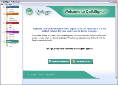
When you first open QuikSigma you are greeted by
the welcome screen. The two large green buttons
get you started by asking if you would like to
begin a new project or open an existing project.
|
| |
|
|
| |
|
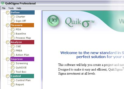
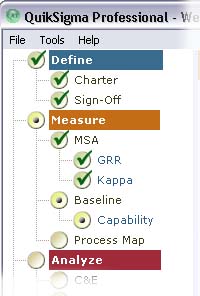
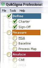
On the left on the project navigator is
displayed:
Define
,
Measure
,
Analyze
,
Improve
, and
Control
. These are the DMAIC phases.
Under each phase are the major tools that will
be used. This provides a visual road map to keep
the belt on track.
|
| |
|
|
| |
|
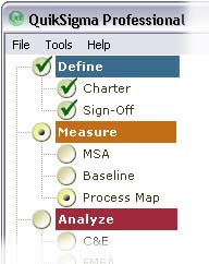
As the belts proceed their progress is tracked
making it easy for the champions to follow.
Check marks indicate tools completed and dots
indicate work in progress. The define stage is
done but this belt is skipping the MSA and
Baseline steps, time to call the mentor.
|
| |
|
|
| |
|
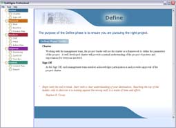
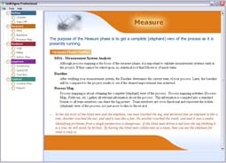
When you click on the colored phases in the
project navigator a summary is displayed in the
main window. These phase summaries remind the
belt what the purpose of the phase is and how to
proceed.
|
| |
|
|
| |
|
Here the belt is in the Measure phase and clicks
on MSA to begin (Measurement Systems Analysis).
|
| |
|
|

Æ
|
 |
|
| |
|
When the belt clicks on MSA a lead in screen
helps the belt remember what MSA tool best
applies to their project. For a categorical
measurement system a Kappa test is selected.
|
| |
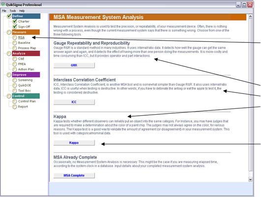
MSA is clicked
A lead in screen reminds the belt
which tool is most appropriate
We need Kappa
|
| |
|
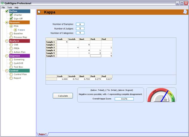
Notice that as the belt works in Kappa it
appears on the project navigator. The navigator
marks it with a dot to show work in progress. In
the lower right the graphical gauge is easy to
read, the
blue needle is in
the red, not good.
Also to the left of the gauge is an explanation
in plain English reminding the belt how to
interpret the results.
|
| |
|
| |
|
If the belts have trouble remembering how the
tool works they can click on the light bulb and
get instant tutoring. This explains concepts,
shows them how to set up the tool, and how to
interpret the results.
|
| |
È
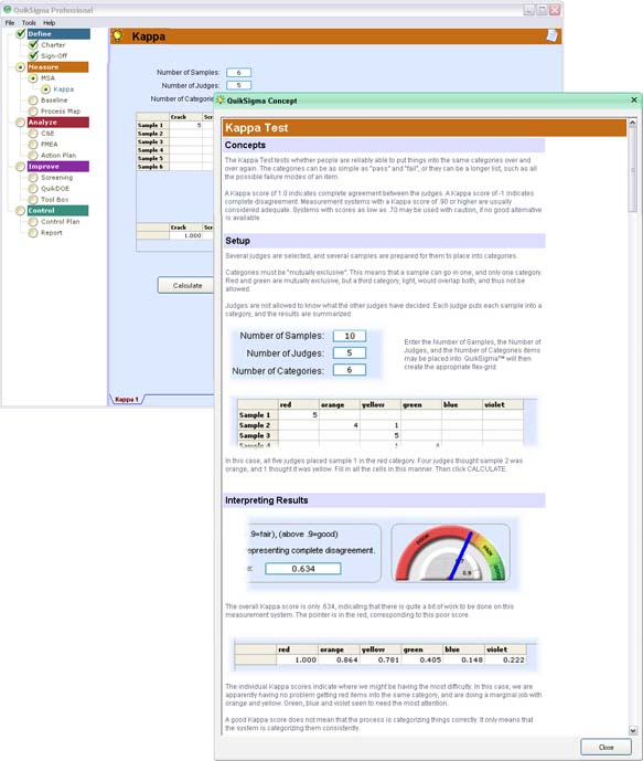
|
Concepts
Å
Setup
Å
Interpreting Results
Å
|
|
| |
Having the phase summaries, the tool lead in
screens and the light bulb setup and
interpretation screens as a constant guide is a
huge factor in why the belts are succeeding but
there are many more features that help ensure
their success.
|
| |
|
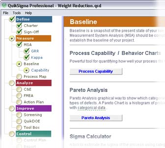
Lets look at a capability analysis for example.
Capability was opened by clicking
Baseline on the
project navigator and then
Process Capability on the lead in screen.
|
| |
|
|
| |
|
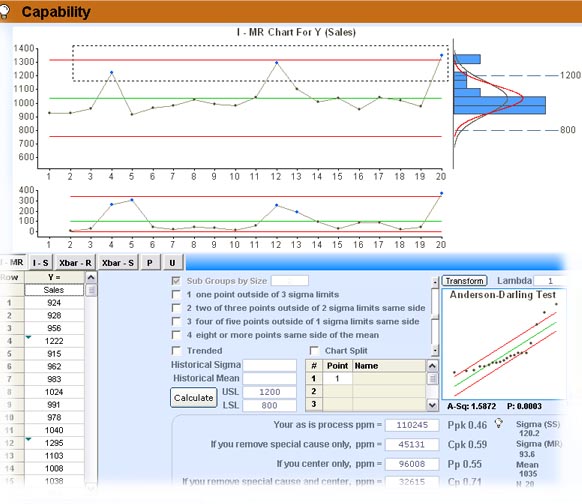
All the important steps in a capability study
are built into the tool. To test for stability
and predictability a behavior chart (control
chart) is provided. to make sure the PPM
estimates are valid a normality chart is
provided, the slider bar lets a green belt know
that a senior belt should assist when it dips
into the red. |
| |
| The Behavior chart, also
know as a control chart. This is what
you would typically see in an I-MR
chart. we will spice things up in just a
bit. |
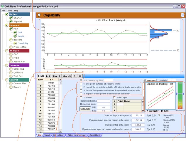 |
| This is where you select
the type of chart (I-MR, I-S, Xbar- R,
Xbar-S, P, and U) |
These are tests of
special cause |
Your specs go here, this
is also where you can split or trend
data! |
This let you know just
what to do with your process again in
plain English. The PPM numbers are given
as well as the traditional capability
indices |
Normality chart and
slider bar. its in the green so I can
believe my PPMs |
|
| |
|
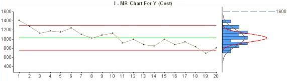
Now to spice things up a bit. This is the kid of
chart you get with trended data if you don't
have QuikSigma®.
|
| |
|
| |
|
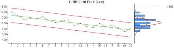
Just by checking Trended you have a trended
chart. Nice! |
| |
|
| |
|
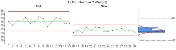
Chart Split is another nice feature. Use it to
compare the Old process with the new improved
one. |
| |
|
| |
|
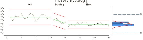
Or mix Trended with Split, you wont be able to
do that anywhere but QuikSigma®. Very
Nice! |
| |
|
| |
|
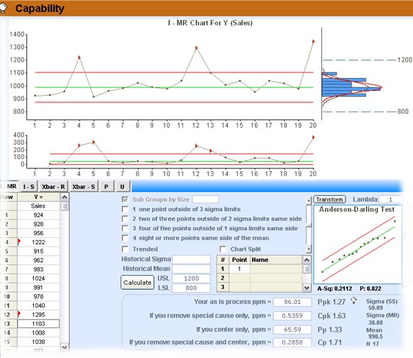
Outliers that should be removed are also nicely
handled. You can see how the three outliers are
captured by the mouse. Any point selected in the
chart will be identified in the data column by a
q blue
triangle. This is handy. |
| |
|
| |
|
The points selected are effortlessly flagged.
Notice the
} red triangles
on the chart and in the data column. Now the
limits on the chart no longer reflect the bad
data but they can still be seen. also notice we
didn't halve to put an asterisks and lose the
data. Much better!
|
| |
|
| |
There are many great features that this tour
can't even begin to cover. By now you should a
sense for the way belts can quickly get thru
projects correctly the first time. For more
information or to arrange a demo please contact
us.
|
| |
|
Request Information
|
| |